When I joined the team in 2014, Sync wasn't delivering on its promise because, while its user base was growing, most users just didn't get it. By turning the team's focus from "competitors have more functionality" to "users don't experience ours as having enough functionality", I helped bring design thinking to Sync.
1
The design team's initial, heuristic evaluation of the product resulted in the following observations:
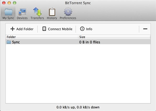
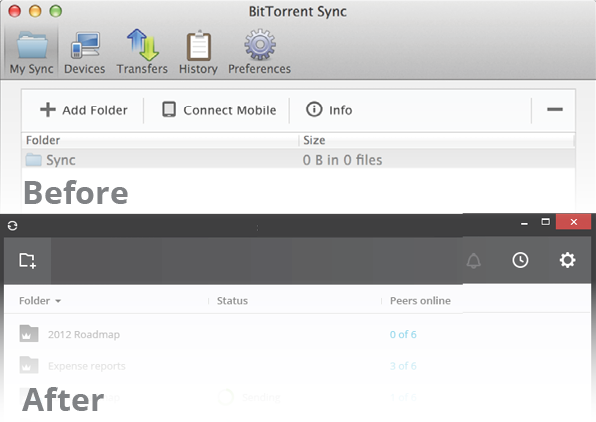
1. The interface is complicated and confusing. The five items along the top are tabs, and result in changing the whole view below. Most users didn't understand the difference between "Transfers" and "History" until after examining the tabs.
Also, the information architecture of the next row of items is amiss because "Add folder" does the same thing regardless if a folder is selected, while "Connect mobile" and "Info" apply only to the selected folder.
2
2. It's not clear nor intuitive what is happening with most of the elements onscreen.
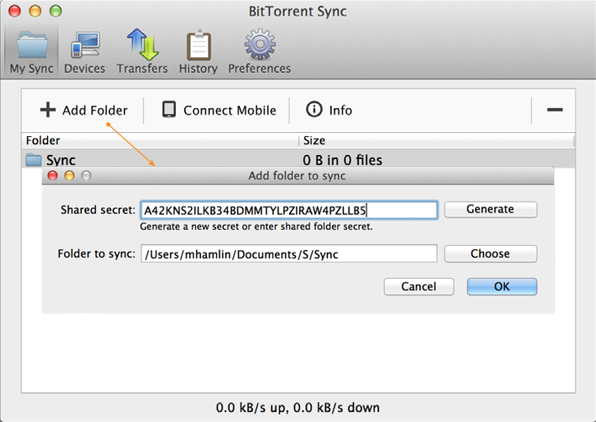
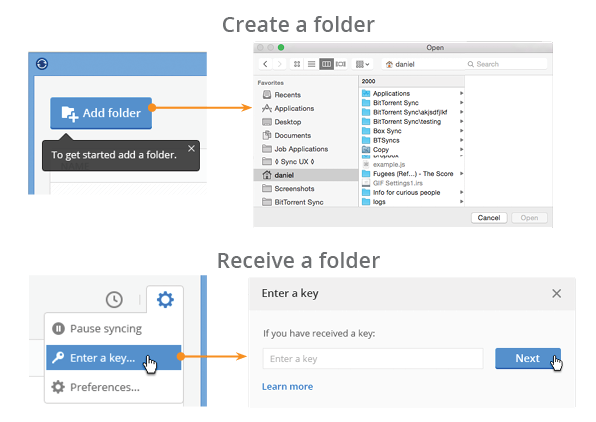
3. Users were failing at the most central task: adding a folder.
3
There are two reasons to add a folder - I'm about to send it to another device, or I'm receiving it from another device or user. The problem is that these are both represented in one screen, and it's not intuitively clear how the user should distinguish which function to perform.
New users didn't know what a secret key was, and frequently lost an incoming folder by pressing "Generate" after pasting a secret key. I saw a simple solution: separate these two usecases into different flows.
4
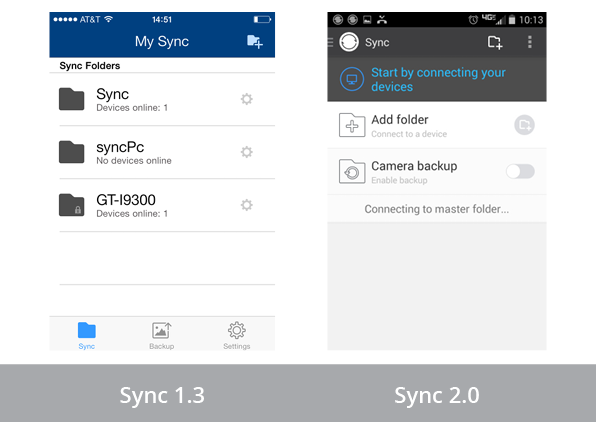
Because of the product's impressive growth to 100k users, along with other factors, the team wanted to keep the original design. To make the problem tangible, we brought new users into the office to test the product's usability. Most of them struggled when using the product. See quick video clip of the problem.
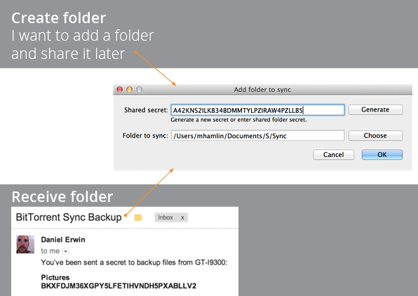
We fixed this key problem in two ways. The first was with a new interaction design - the two usecases are now accomplished with two separate controls. Each control is more intuitive because it gives feedback that only makes sense for one of the two tasks. This fix resulted in a greater proportion of users adding more than a single folder.
6
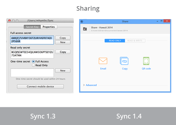
On the sharing screen, we cleaned up the visual layer by hiding the cryptographic keys, deprioritizing security options, and moving the option to generate a new key (thus disconnecting all other devices) to the "Preferences" window. Clarifying the structure and hierarchy of this page allowed us to create a simpler experience that guides users to the 90% usecases, instead of equally emphasizing all possibilities.
7
We also cleaned up the main view so that it's more clear at a glance what the important elements are, and where the key actions can be initiated. Rather than tabs for "Devices" and "Transfers", we used folder-specific windows for each (under folder options menu). This simplified the folder list, made the app more object-oriented, and simplified finding a device or an ongoing transfer.
8
Another design principle we applied is known as progressive disclosure. By waiting for the user to interact before giving them more details about an item, we cut down on the clutter onscreen and make it possible to see the high-level view.
9
For Sync 2.0, we were charged with bringing Sync to tens of millions of new users. To understand and address this new market, we used several design processes:
identify targeted personas
strategic collaboration with marketing
user testing of early wireframes
iteratively review designs of new features
10
In addition to the desktop design, I gained responsibility for:
mobile design (1 interaction and 2 visual designers)
desktop visual design (1 visual designer)
aligning with marketing websites and other touchpoints
design strategy and research for potential new products
11
We clarified our focus on a much larger, less technical, audience.
12
Sync is fundamentally different (no cloud) - but didn't signal this to Jake & Melissa.
13
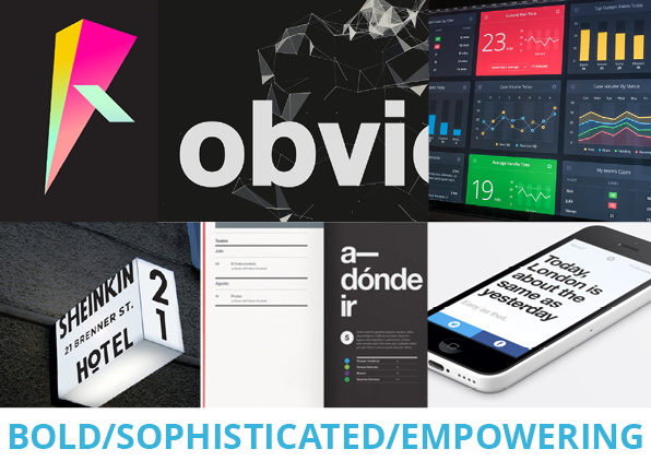
I created a process for the marketing and product teams to align on a perspective about how a radically powerful, distributed tech should look. This was interesting because we had to take a step back from the visuals and first agree on the terms Bold, Sophisticated, and Empowering.
14
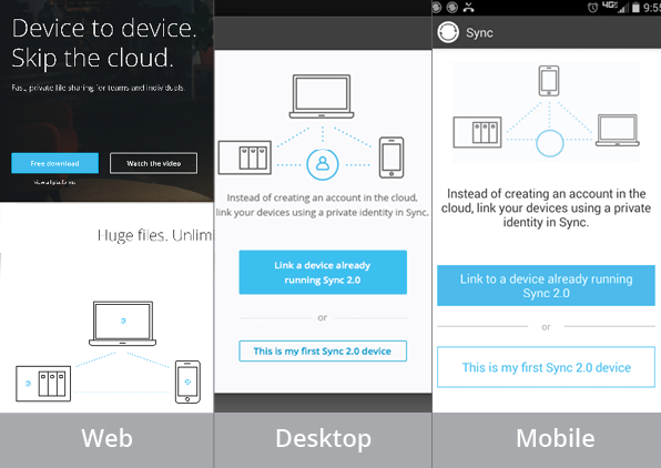
Now that visual details are aligned across platforms, users can intuitively sense that they are in the right place.
15
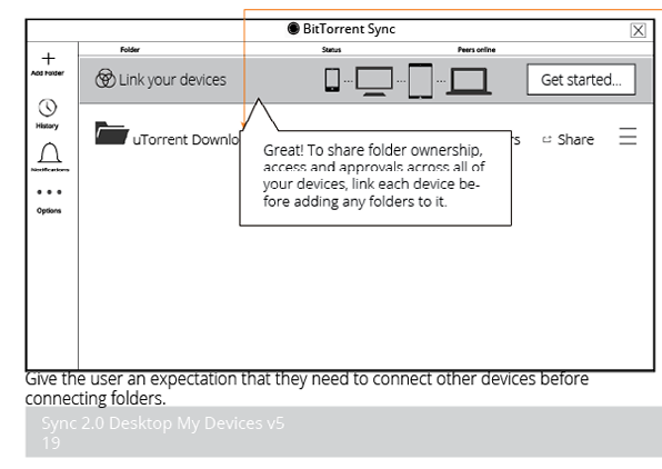
In this cycle, we took time to discuss information architecture before it was implemented. This part of the functionality went through many revisions as the engineering team discovered new constraints and the rest of the team drafted potential solutions.
As soon as we had confirmation that the internal team was satisfied with a design, we showed users quick prototypes of key flows to make sure they would be usable.
17
A key development for the team was to use only one primary option at a time. This basic design principle helps users get through tough choices.
18
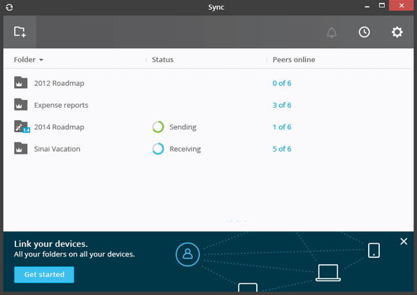
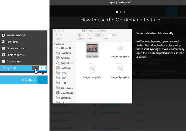
In 2.0, we introduced Sync all off (aka Selective Sync). This lets users choose which files to sync. It's so powerful that Dropbox offers only a partial version, and Microsoft removed it from OneDrive. Sync addresses this dangerous power by making it available for brave users without advertising it to all, and by explaining it when the user first engages the feature.