I started rethinking this payments flow because it fell in the crevice between Sync's marketing team and the product team. Since I wasn't certain whether any engineers would be free to do the work, I started with a simple analysis of what fixes could be quickly made. This was useful for starting the discussion with project managers about what the scale and scope of work was.
1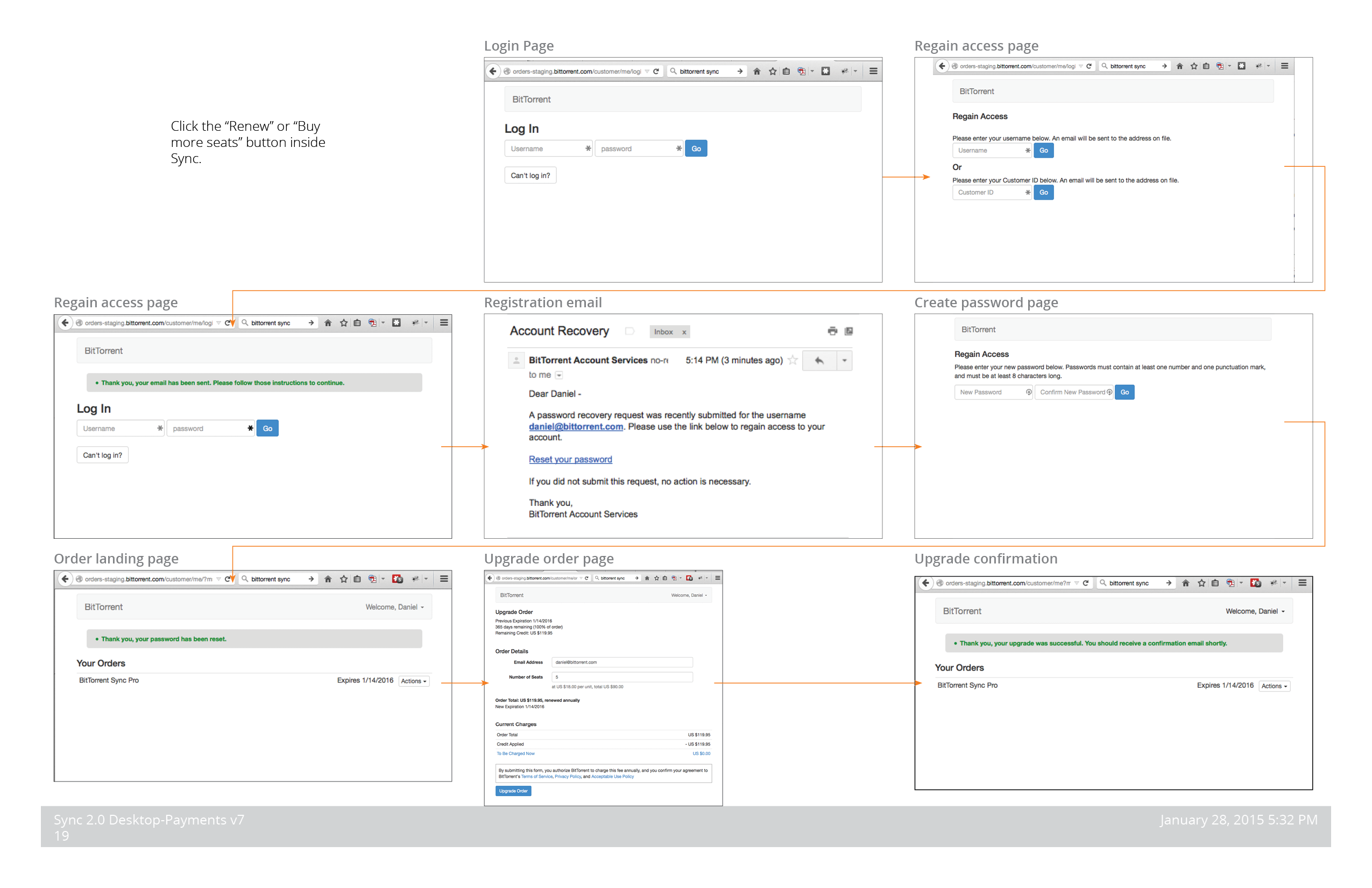
Once we had an engineer assigned to complete the work described above, I wanted to discuss with management how to improve the experience at a deeper level. So I created this diagram showing the entire flow, and highlighting in pink key areas to change.
2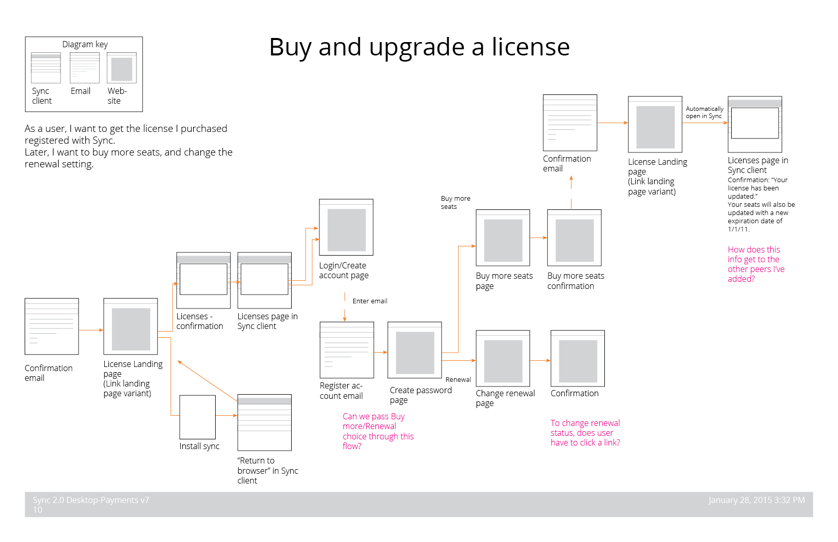
This is part of the solution design we ended up with. Because this was a low priority for management, we didn't invest any time in visual designs until after it was implemented. In this wireframe/flow diagram, only the new (not already implemented) pieces are described in any detail.
3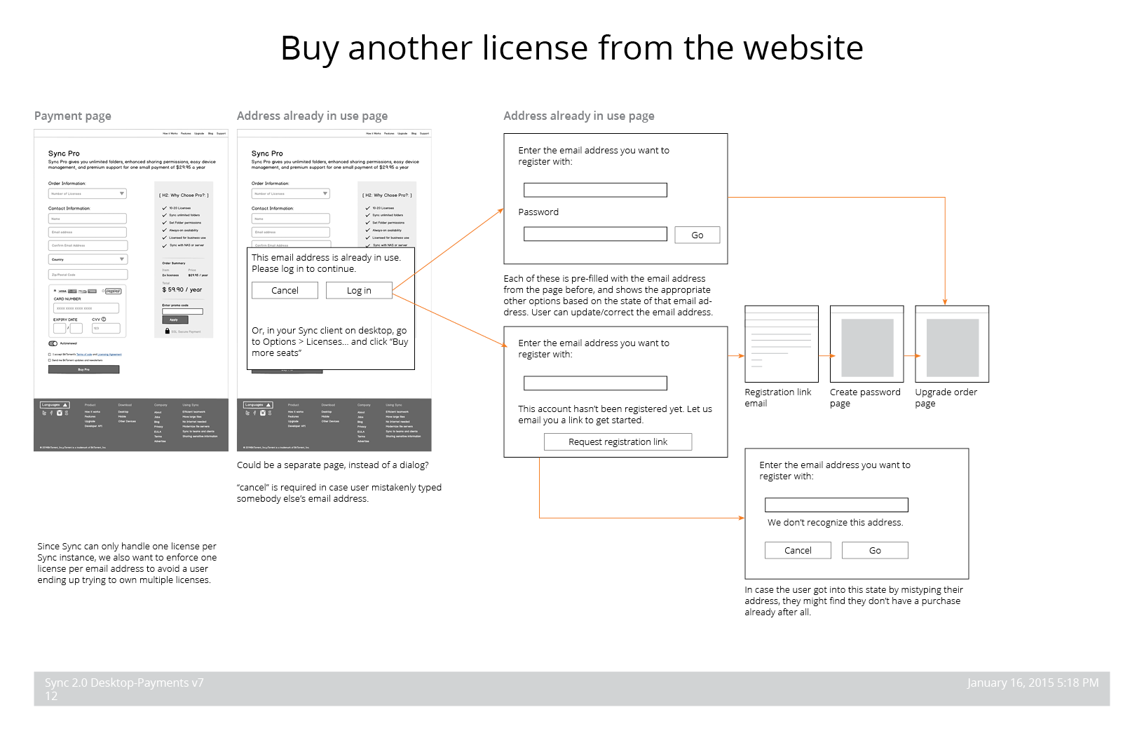
Another example of the power of user flow diagrams is this representation of the onboarding flow. In our first few weeks of envisioning this feature, the product manager and I developed this view of the functionality and verified with engineering that it would be feasible. Later, we added the "Multiple Certificate option" labels to this, to distinguish it from the alternative design below.
4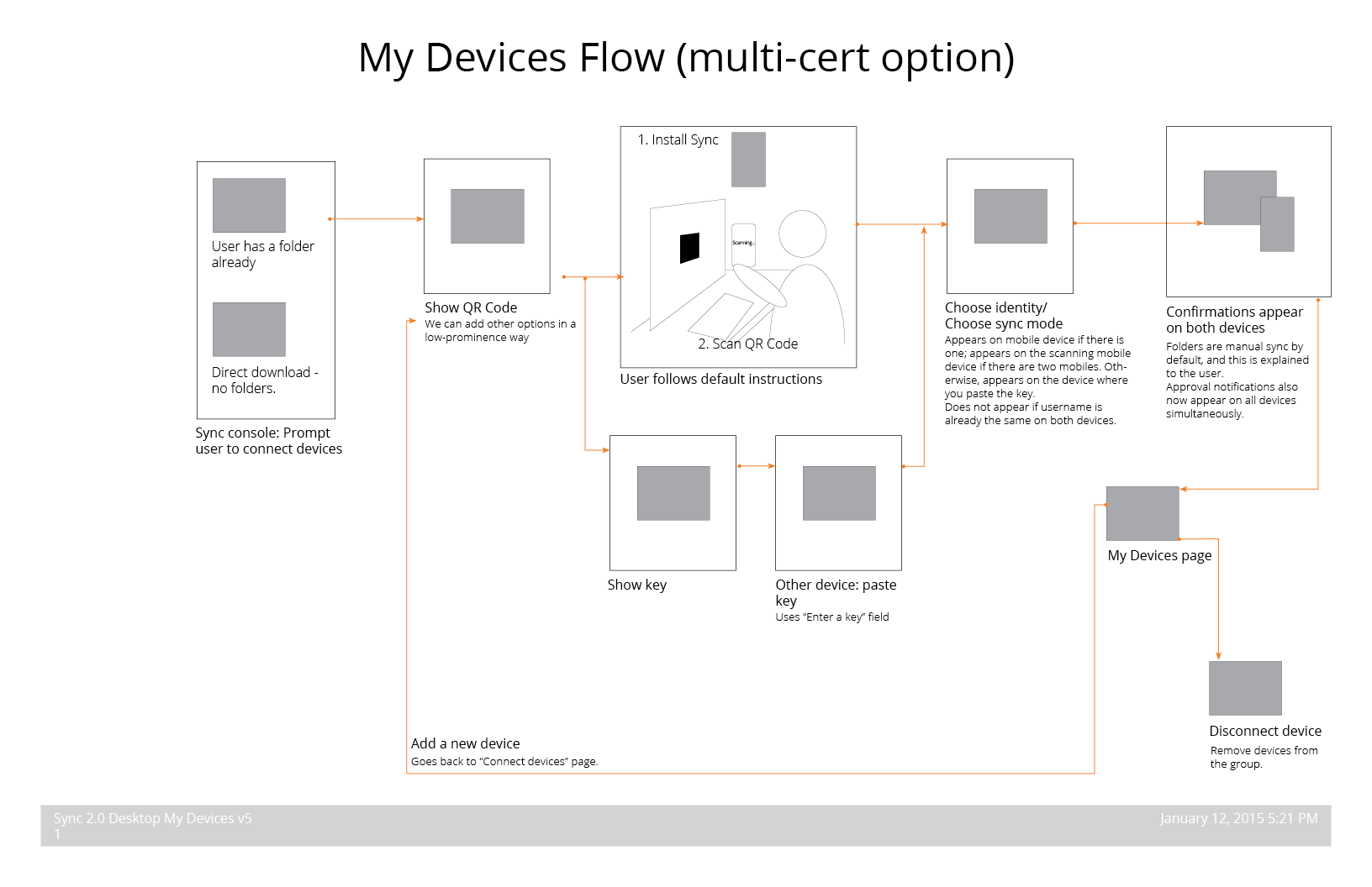
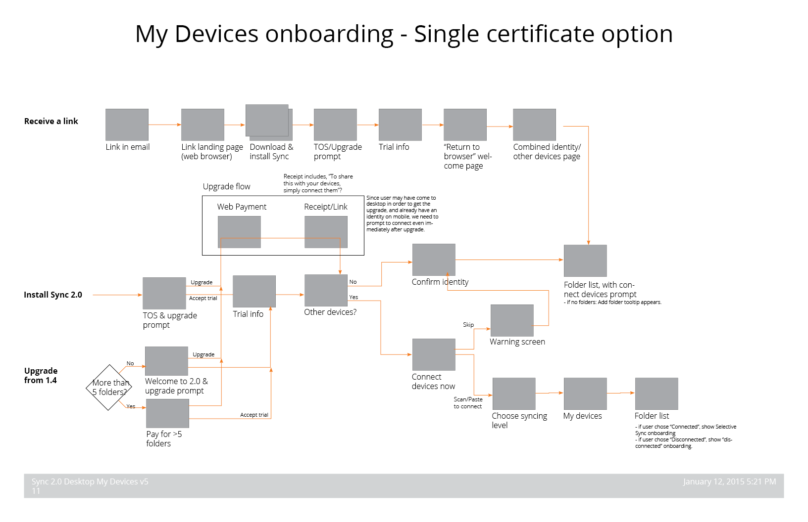
Obviously, this flow is more complicated and requires more UI work to support. We implemented this because it required less back-end work. While these diagrams helped to clarify the discussion around these features and what was feasible or not, in the future I would invest in more detailed, marketing-style prototypes to help get the team aligned around the more preferable option.
5